

Branding
A wide range of construction materials and tools is the primary activity of the hardware store "Koloraj". Visual characteristics are solid, precise, and clear which are represented through the logo form.The letters "O" in the form of the screw head also subtly and clearly support the main idea.

Fonts & Colors
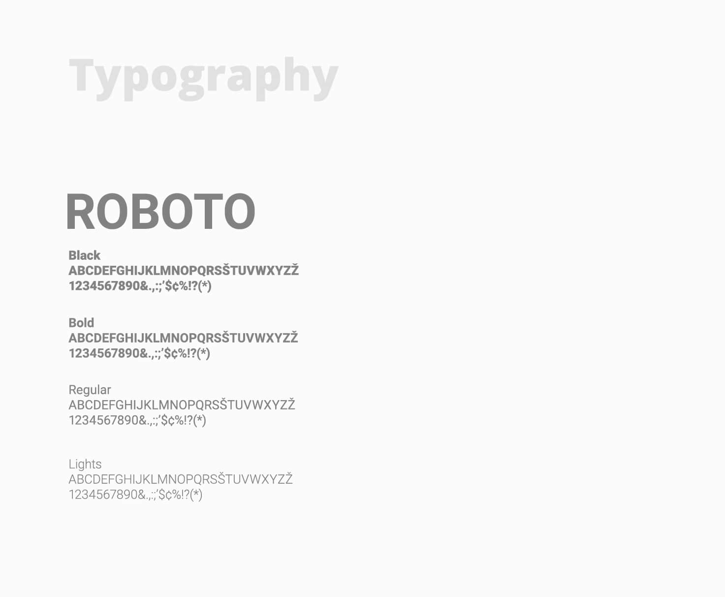
Main font used was modified Zona Pro, all other typography is in Roboto font.
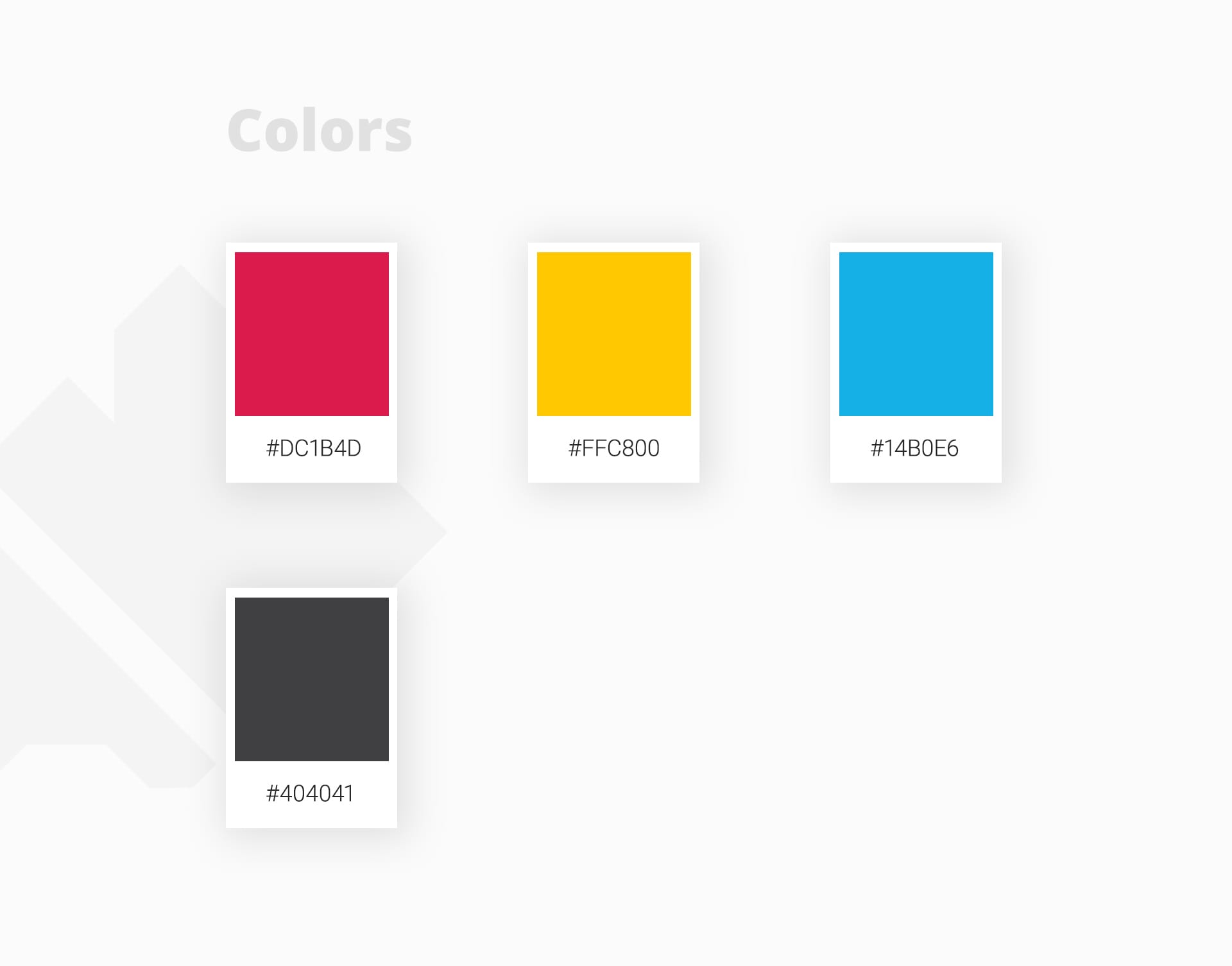
3 colors (yellow, red, and blue) + gray hint at a segment "Paints and varnishes" but they are also inspired by the colors of Rijeka's coat of arms and also called "Koloraj" (Rough translation would be colorized). Gray as a neutral color it refers to other materials and is also a good addition to incorporated colors.
Graphic design
Few assets was designed for the first and primary use. Simple yet effective.

Web design
A simple one-pager site was designed for informational purposes. When the business grows and expands then it will be required to upgrade the website.

Next project