
Branding
Here I had two challenges:
1. to incorporate the two brandings on the website: personal brand for miss Vlaović and brending for IVID interior
2. to move from the "bold" and "aggressive" attributes that are mostly associated with the interior design brands - technical, creative, precise... but still to keep them.
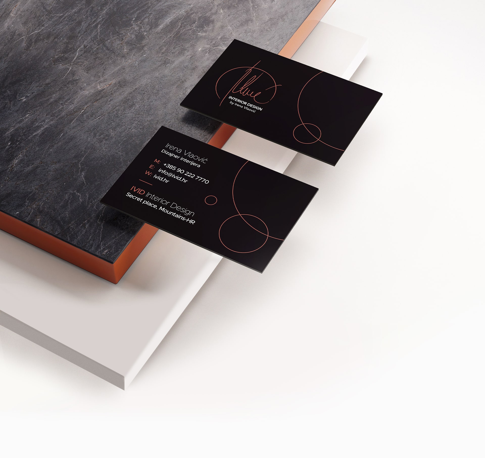
For the brand logo, I have chosen to start with clean shaps to communicate this before mentioned "bold" attributes (technical expertise, precision, experience, creativity...). So I created the logo from geometrical lines and softened it with different line thicknesses and added the circle shape which will become the central shape of the two brands.

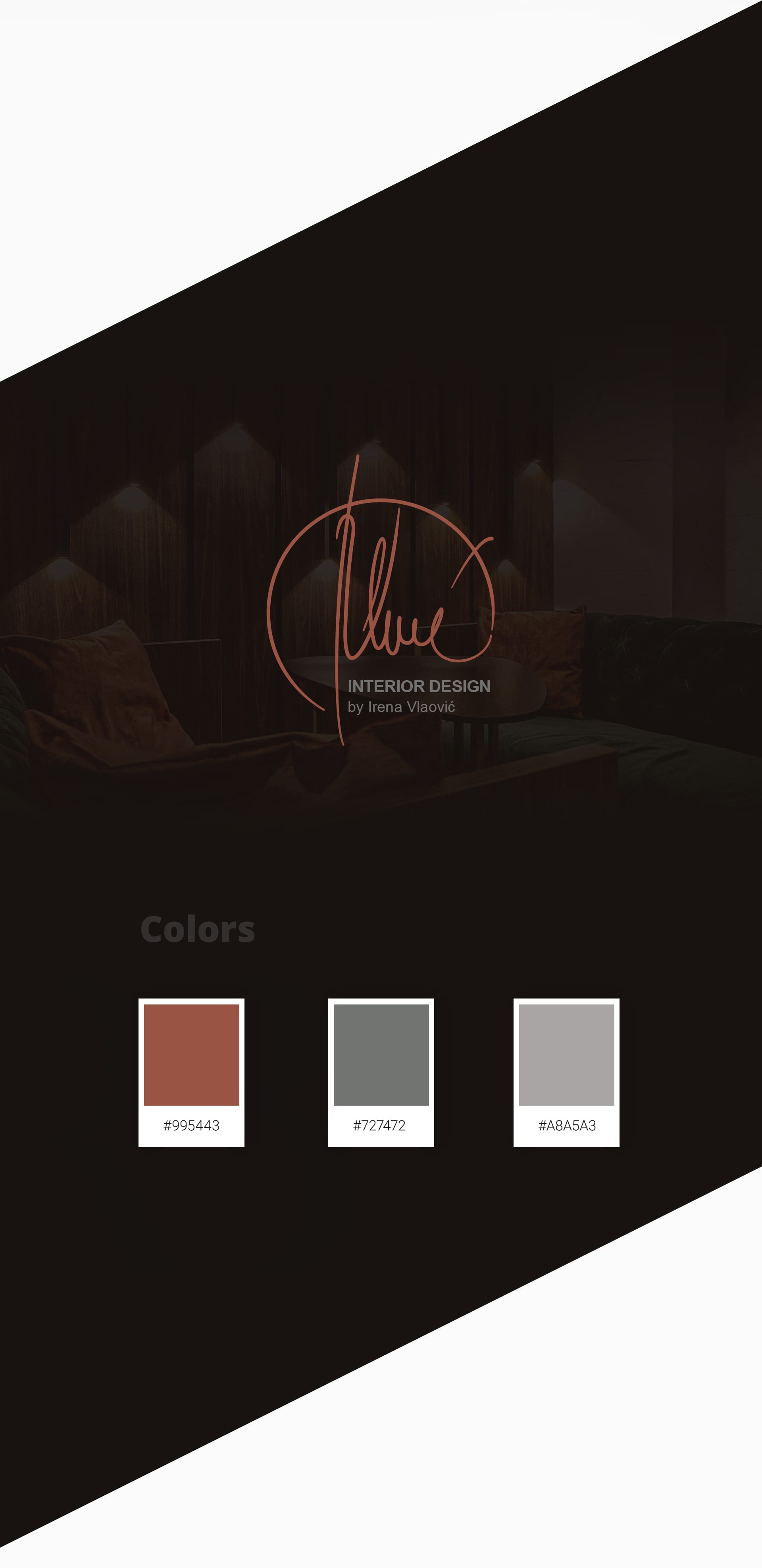
Irena Vlaović signature
The logo for personal branding was done from the signature od miss Vlaović and connected with the IVID logo through the circle element. Her signature is really tight with high and elegantly curved lines - it has this warm, stylish note and the circle visualy conects her with the IVID - interior design.
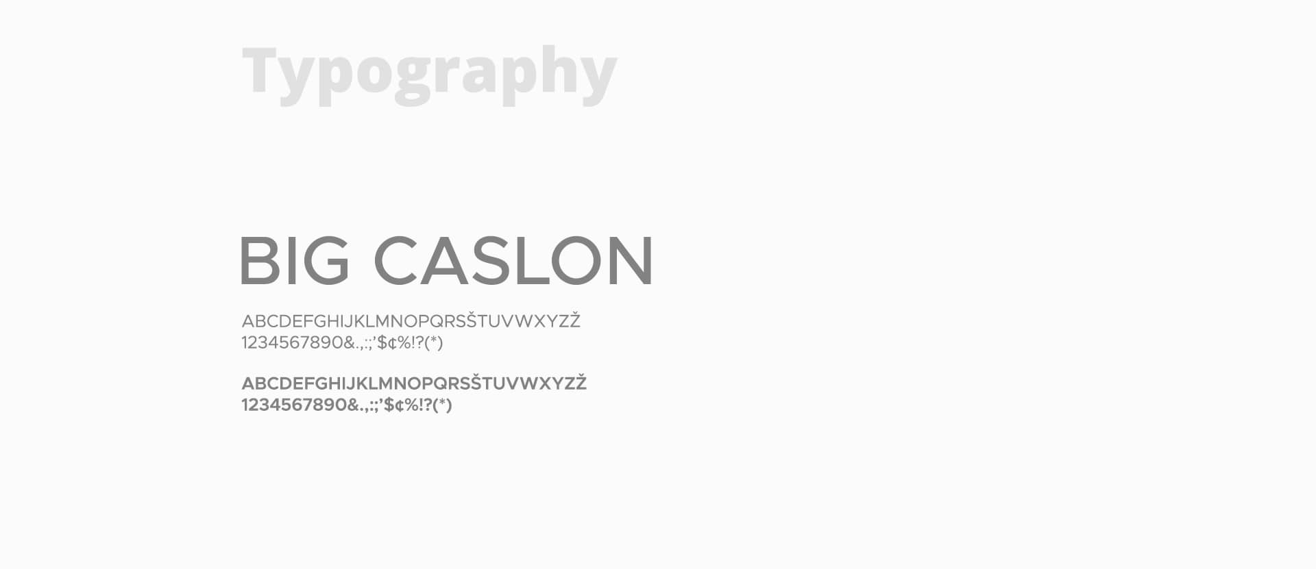
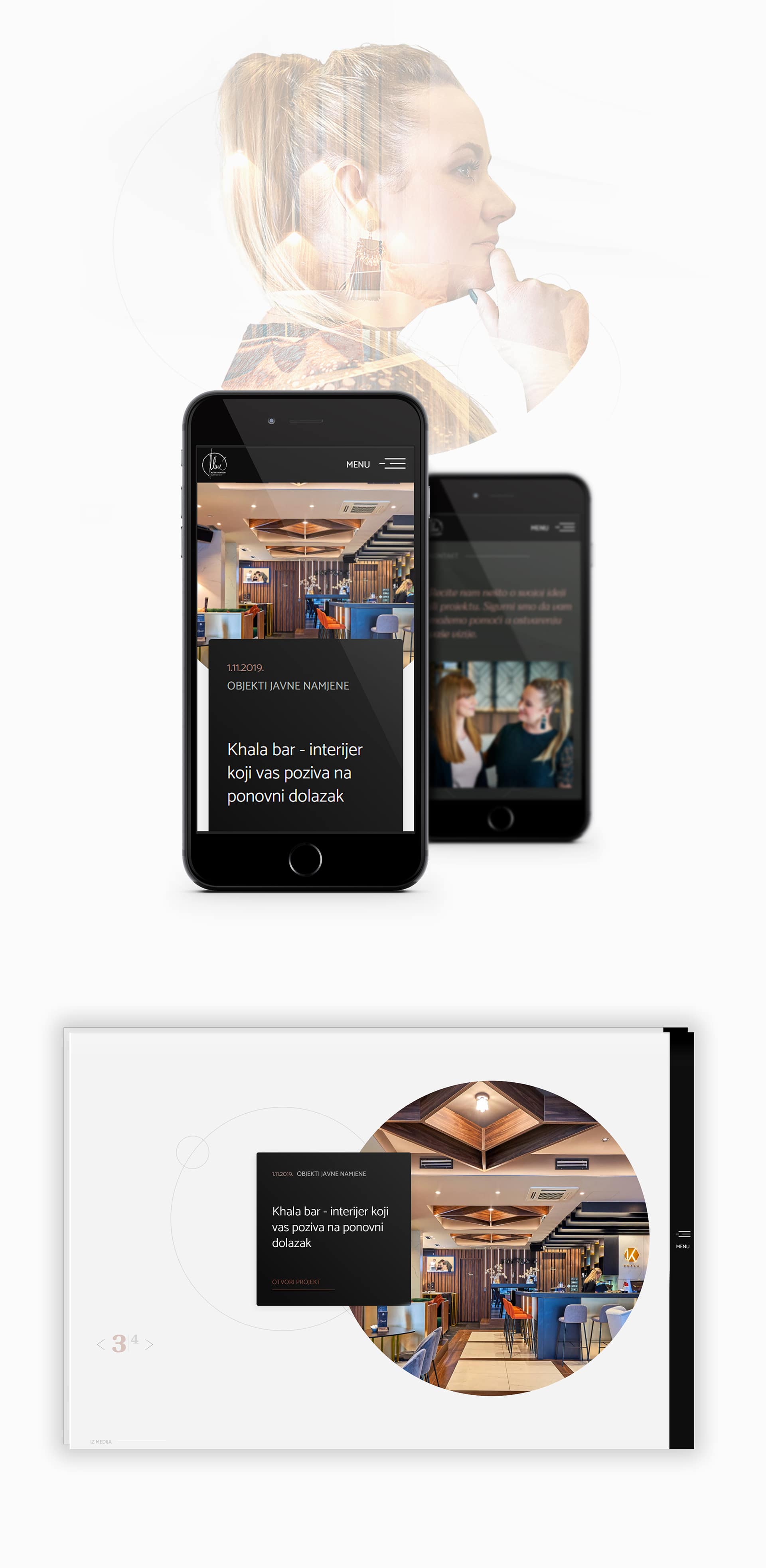
Graphic design
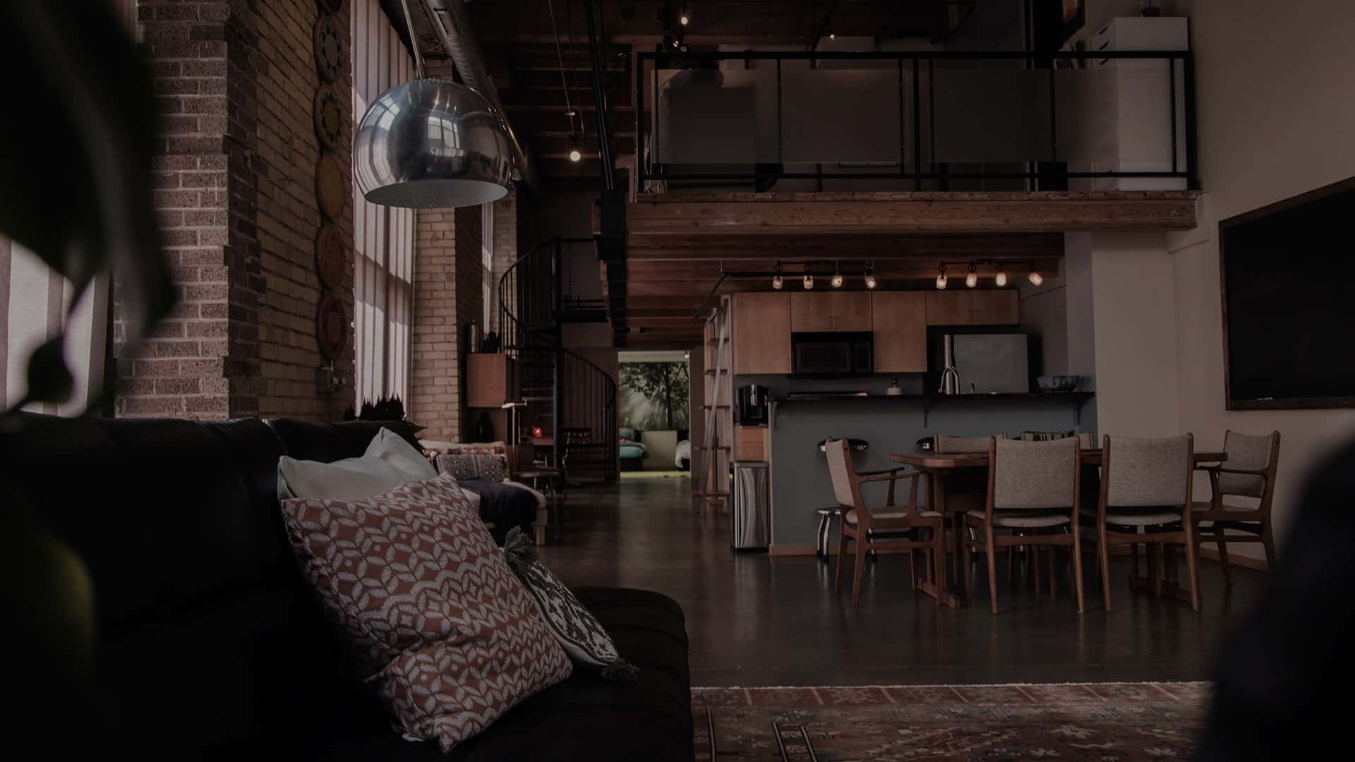
Simple, elegant in a darker manner with tones of copper.
Web design
On the very top, you will see the personal branding logo of Irena - playful, stylish, elegant... and in the footer, you will see the IVID brand logo - the symbol of precision, perfection. Both having the circle element as the dominant and the website having the circle element in its design giving the user the clear representation of interconctivity between the logos and telling a story of precision, passion, friendliness, and elegance.
You can check IVID. Project was created while working at ICONIS.
Next project